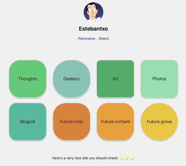
2024-03-17 UPDATE: I changed my home page to a more conventional one. The one I designed was quite gimmicky. If I ever learn a bit more about web design, I may come back to visually depicting my garden metaphor. For now, the patches in my garden, meaning the different sections of my website, will be featured in the conventional navigation bar.
I want my site to resemble a garden, so a few days ago I made a home page with buttons that represent the patches you can find as you walk around one.
Tonight, fiddling a little more with the site, I asked MacGPT to give me some simple code to change the color and the shape of these buttons. I managed to choose my own colors and even give an animation to each of them.
The patches that have content are different shades of green and are animated when you hover over them. The ones that are waiting for future content are yellow-orange-ish and static. I think they do convey that they are not alive yet.
And I added a link in the navigation bar that brings you to that home page. It’s called Panorama, because it gives you an overview of the garden.
Do you like it? Maybe the animation is a bit too much, maybe the colors are not right, maybe the whole concept is ridiculous. I’d love your feedback.
